I don’t really post enough about uniforms on my blog. I love uniforms, and I follow several websites that keep me up to date on all the tweaks and changes that go on through a season. For true uni-nerds, you really need to check out uni-watch.com for literally everything from the four major North American sports to Japanese soccer league changes. It covers everything.
While the uni sites out there do amazing jobs of reporting changes, I want to comment on one change, that albeit slight, is significant in my mind.
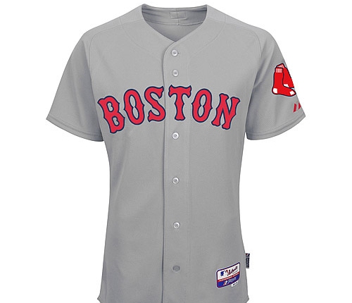
 The Boston Red Sox have gone back to a red script on their road uniforms. They won the World Series in 2004 and 2007 with these roadies, then they changed to the blue font that has been seen for the past couple of seasons. While I didn’t mind the change, it made the road greys seem more bland, and for a team with Red in their nickname, it was lacking something for sure.
It is a welcome change back to the way it was before. The red offers more pop to the name of the city, and it just makes for a better colour palette, in my opinion. The Red Sox should have Red.
 While the blue tended to have a pretty classic, old-school look, in a sport where all road teams are wearing grey as their primary colour, I feel like it is important to have certain aspects stand out on the field. Even the Yankees, with their timeless uniforms, have a dull look on the road, with their combo of grey and blue. The red adds some much needed spark, and will appear more vividly on TV, and in person.
I love the change. Plus, I already own a red font road uniform, so now I can take it back out of retirement!
